
The social media platform X is reportedly contemplating a significant UI update that will introduce a new Like icon, potentially transitioning from the classic heart symbol to a thumbs up icon. This change aims to enhance user interaction and engagement within the app.
As illustrated in a recent post by user Sawyer Merritt, certain users are already encountering the thumbs up icon in place of the traditional heart. Additionally, this new icon has been conveniently relocated to the left-hand side of the post, making it more accessible for users to engage with content.
Here’s an informative side-by-side comparison showcasing the differences between the current application interface and the new proposed format. This visual representation clearly highlights the changes being considered by X.
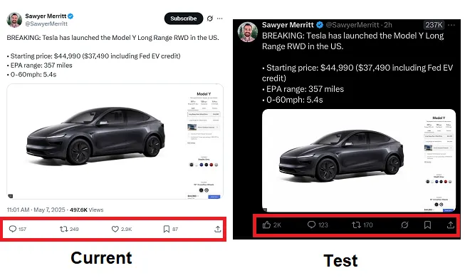
The engagement options at the bottom of each post have undergone a noticeable rearrangement, with the heart icon being substituted by a thumb. This alteration aims to create a more intuitive interaction experience for users.
While this change may initially seem perplexing due to the established user habits within the app, it reflects Elon Musk’s vision to imprint his unique style onto every aspect of what was once known as Twitter. Musk has proposed even more extensive modifications to the UI than just the icon change.
For instance, one of his suggestions includes eliminating the post function buttons entirely and reverting to a more physical engagement model that relies on users’ direct emotional responses rather than digital prompts.

Musk has articulated a desire for the feed to appear “more clean” and streamlined, suggesting that updates like this are intended to both simplify the user experience and enhance overall functionality. Although this might seem logical from a design perspective, removing functional buttons could potentially decrease overall user engagement, as individuals may lack immediate prompts to encourage reactions.
This potential decrease in engagement is likely why X has opted to not implement this change universally across all user accounts, instead introducing the updated “clean” display as an optional feature for users to choose from.
However, the transition from the heart icon to the thumb icon appears to be a different case; it does not necessarily streamline or simplify the UI. Instead, it seems to be a mere repositioning and replacement of the existing heart symbol.
Unless, of course…

Recent reports from users, as shared by X Daily News, indicate that some individuals are now seeing both thumbs up and thumbs down icons displayed beneath posts within the app. This development could provide users with a straightforward way to express both approval and disapproval of content they encounter in their feeds.
Such a dual option could serve as a valuable tool for algorithm training, allowing the platform to further customize and personalize each user’s experience on X. In this context, the switch to a thumb icon becomes significantly more logical and beneficial.
At this point, however, we can only speculate, as X has not provided any official communication regarding this testing phase. Additionally, the platform lacks a dedicated PR department for inquiries. Consequently, we are left to conjecture about the potential move towards an updated system designed to enhance the customization of user interactions in real-time.